Role
This was a solo project. I designed it, wrote all the content, and coded it myself using Middleman, a Ruby static site generator.
Product
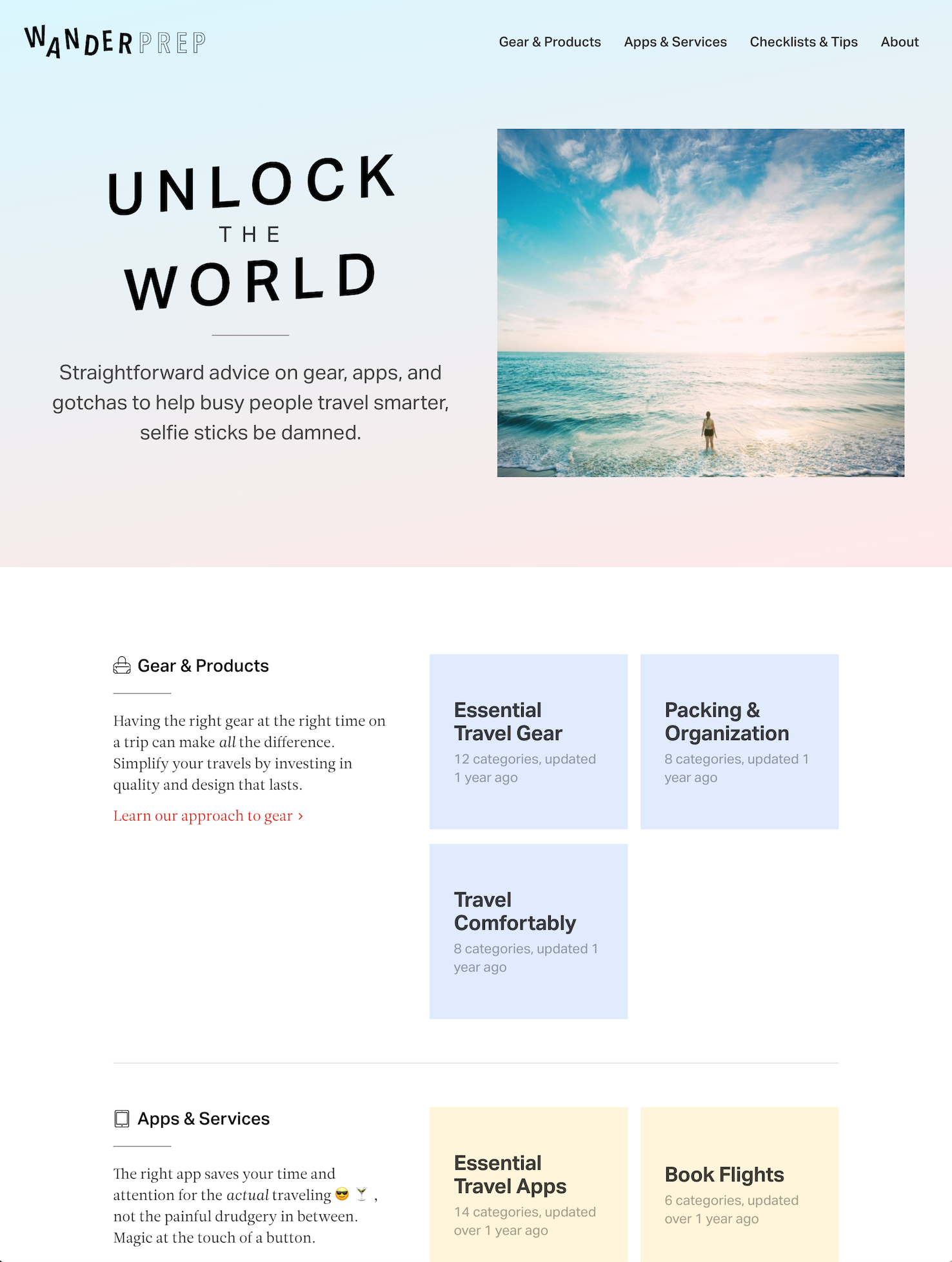
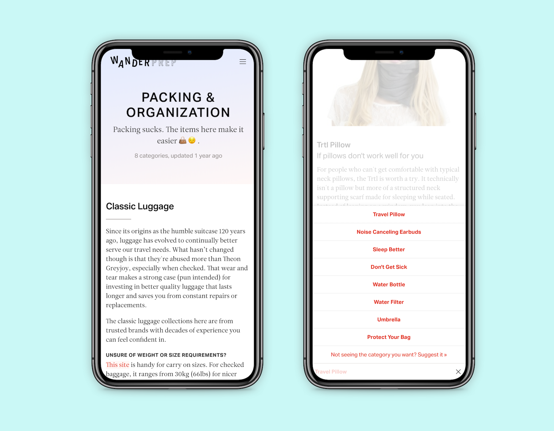
Wanderprep, the predecessor to Wanderium (excuse the confusing naming), is a modern resource for straightforward, “best of” advice on travel products.
The goal was to create a travel version of these two media trends:
- Highly curated “best of” sites like Wirecutter and The Strategist
- Millennial focused publishers with a clever, lighthearted voice like The Hustle and theSkimm
Result
After launch, it was well received and got to #3 on Product Hunt for that day. Feedback on the idea and content was overall good. However, one piece of feedback I continued to hear was it was still a lot of effort to go through each guide to understand which recommendations applied to their trip since every trip is different (international vs. domestic, rainy vs. hot, different laws, etc).
I realized there was a bigger idea, which was to combine data and personalization to automatically recommend the right content at the exact time a user needs it instead of them having to find it themselves, kind of like a Stitch Fix for travel. This ended up becoming Wanderium, and today all the content on Wanderprep has been ported over there.
Although I’ve stopped updating Wanderprep, it’s still live and you can check it out at wanderprep.com.
Remembered.io (2017)

Role
I worked on this with a friend. I was primarily the product manager and product designer, with some frontend development sprinkled in. My friend focused on building the backend in Ruby on Rails.
Product
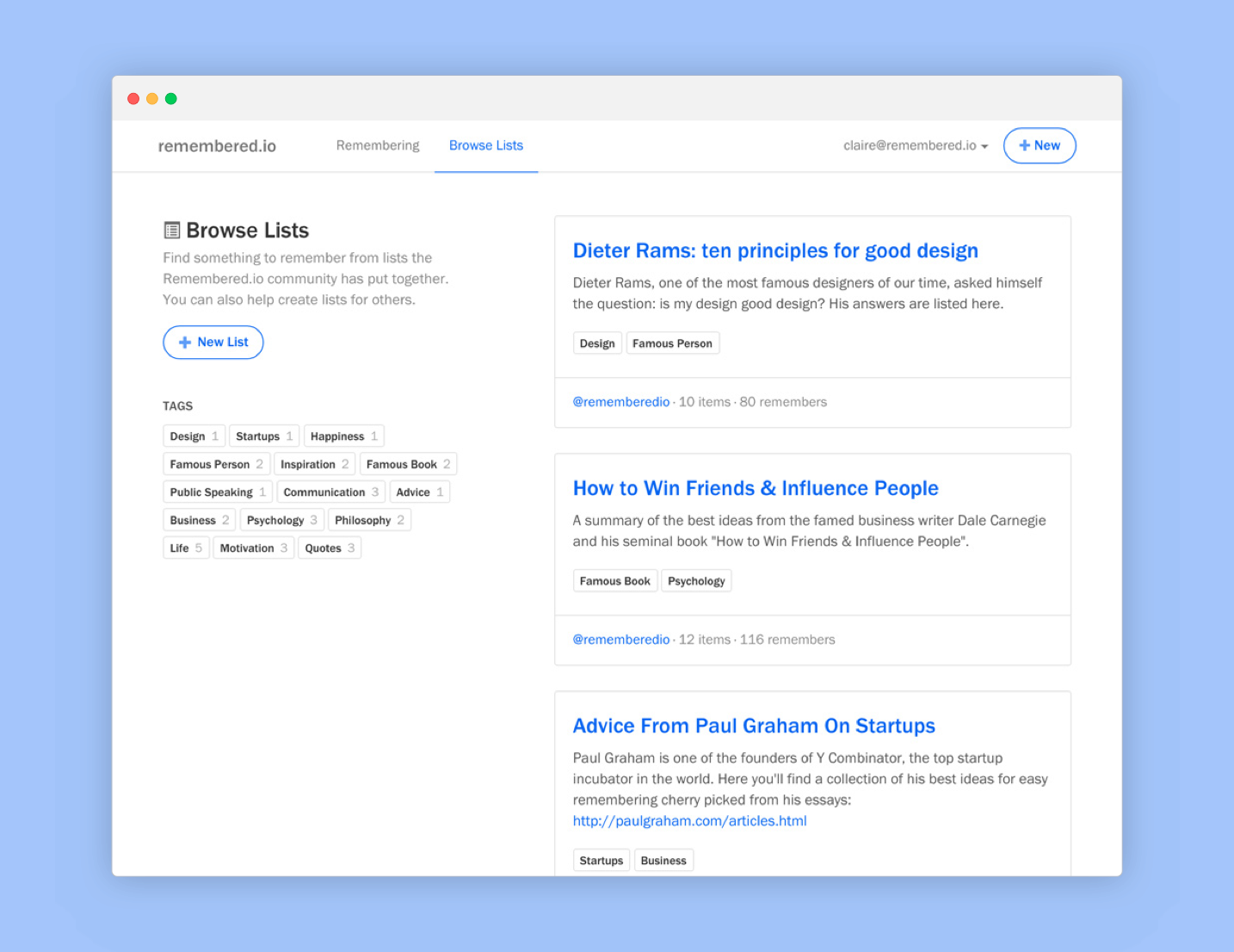
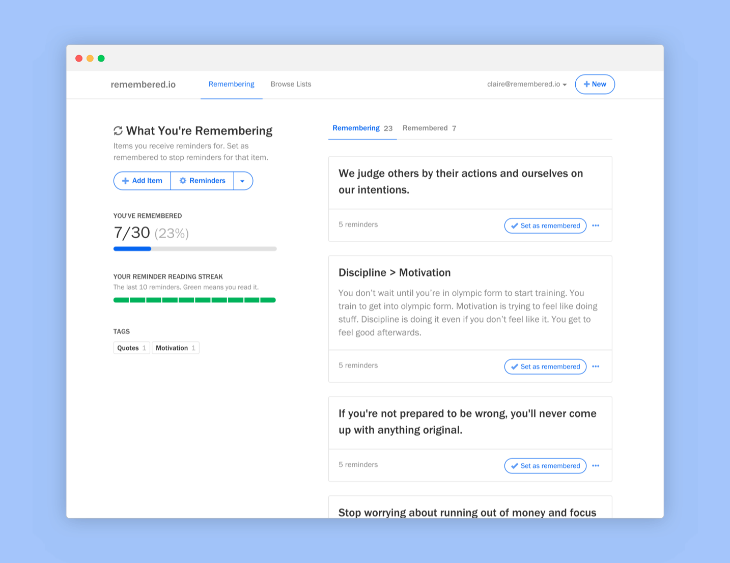
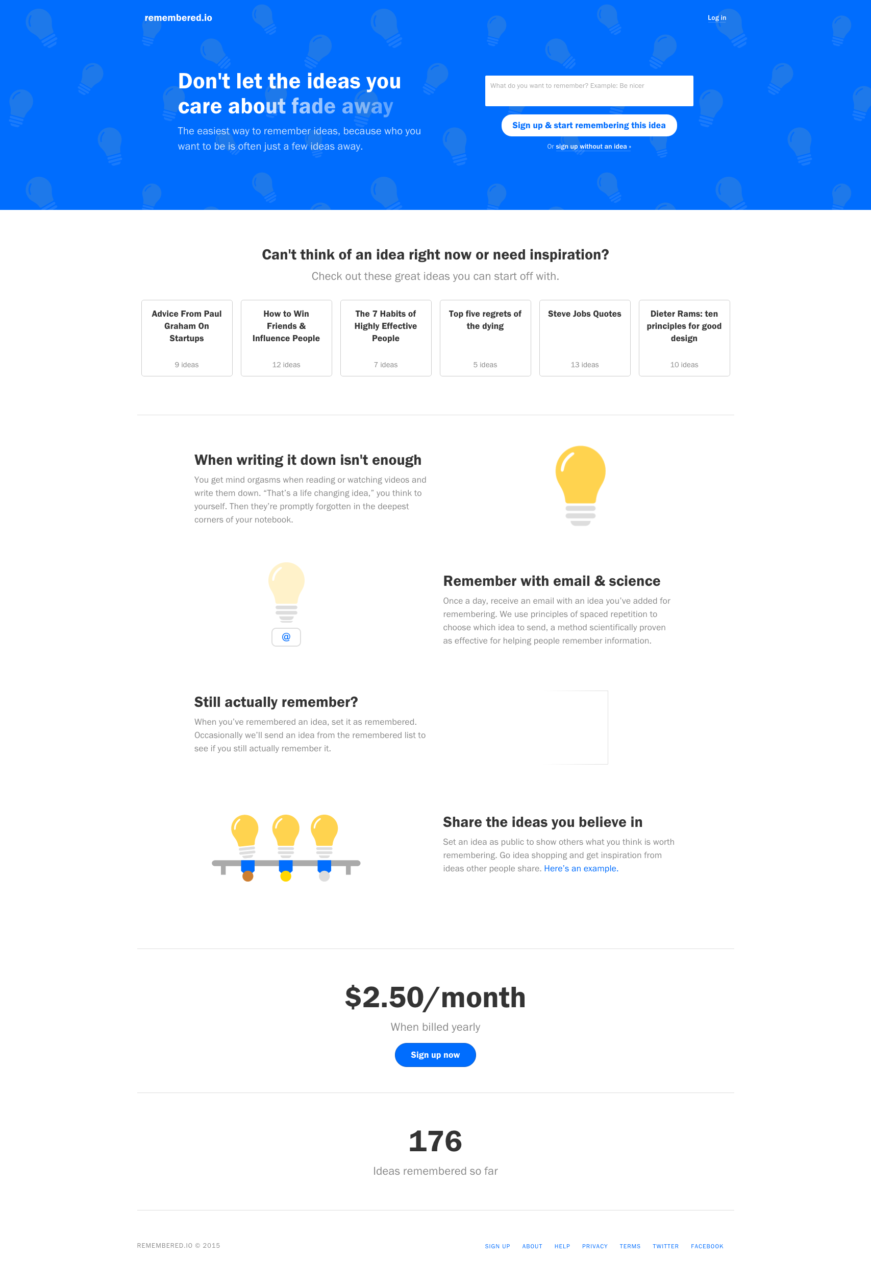
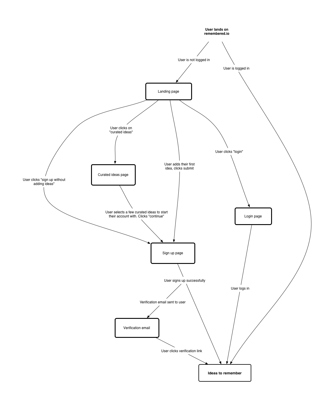
Remembered.io makes it easy to remember and reinforce lessons, ideas, concepts, and more using the scientifically proven method of spaced repetition.
It was a simple idea meant to help my partner and I learn more about building an online SaaS business. We also just thought it’d be a useful tool for ourselves.
Read the launch blog post to learn more.
Result
After launching in 2015, we built it up to ~$5K in ARR. We discovered how important positioning is, as we boosted paid signups by 22% after updating the landing page copy to sound more urgent and be centered around benefits and not just features.
We shut it down in 2017 down after priorities shifted for both me and my friend.
UX Scotland (June 2015)
As a way to challenge myself, I gave a 45 minute talk at UX Scotland in Edinburgh. I’m happy to say it was well received and the audience asked a lot of great questions. I also learned I liked haggis.
Title
Designing for Cohabitation on 3 Million Websites: How Disqus Works Everywhere for Everyone
Description
Disqus is the most popular commenting system available today, used by sites like Hypebeast and Wired. What design challenges were encountered getting there? What tips and tricks were learned? How does Disqus fit into the internet ecosystem and balance so many different types of users? Where are they headed next?
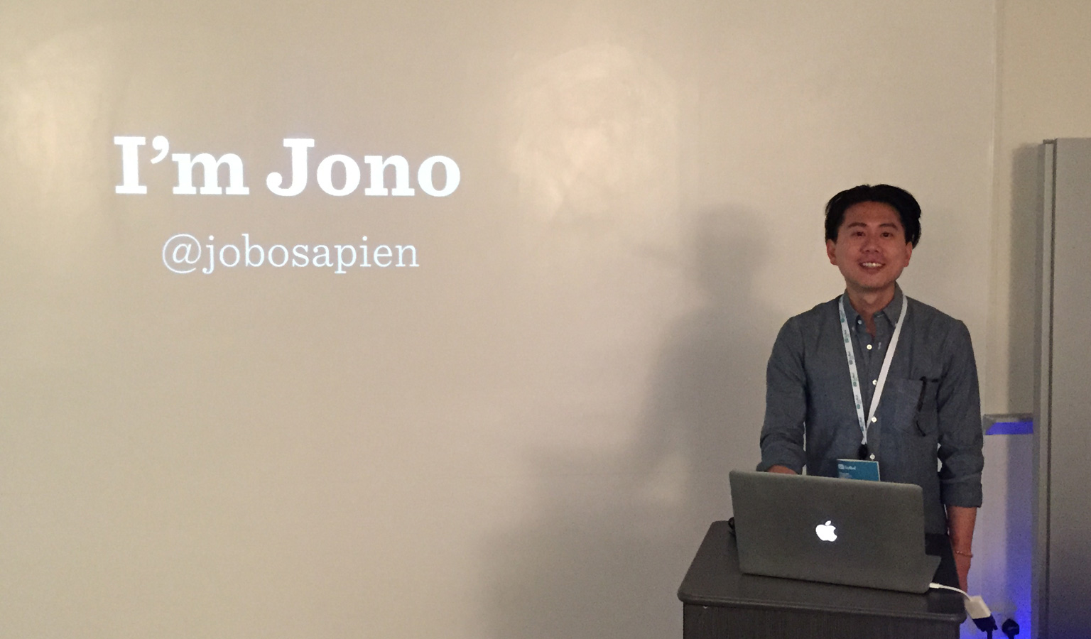
My hair here is, uh, questionable.